
FlowForm by HRE Wheels – Case study / packaging
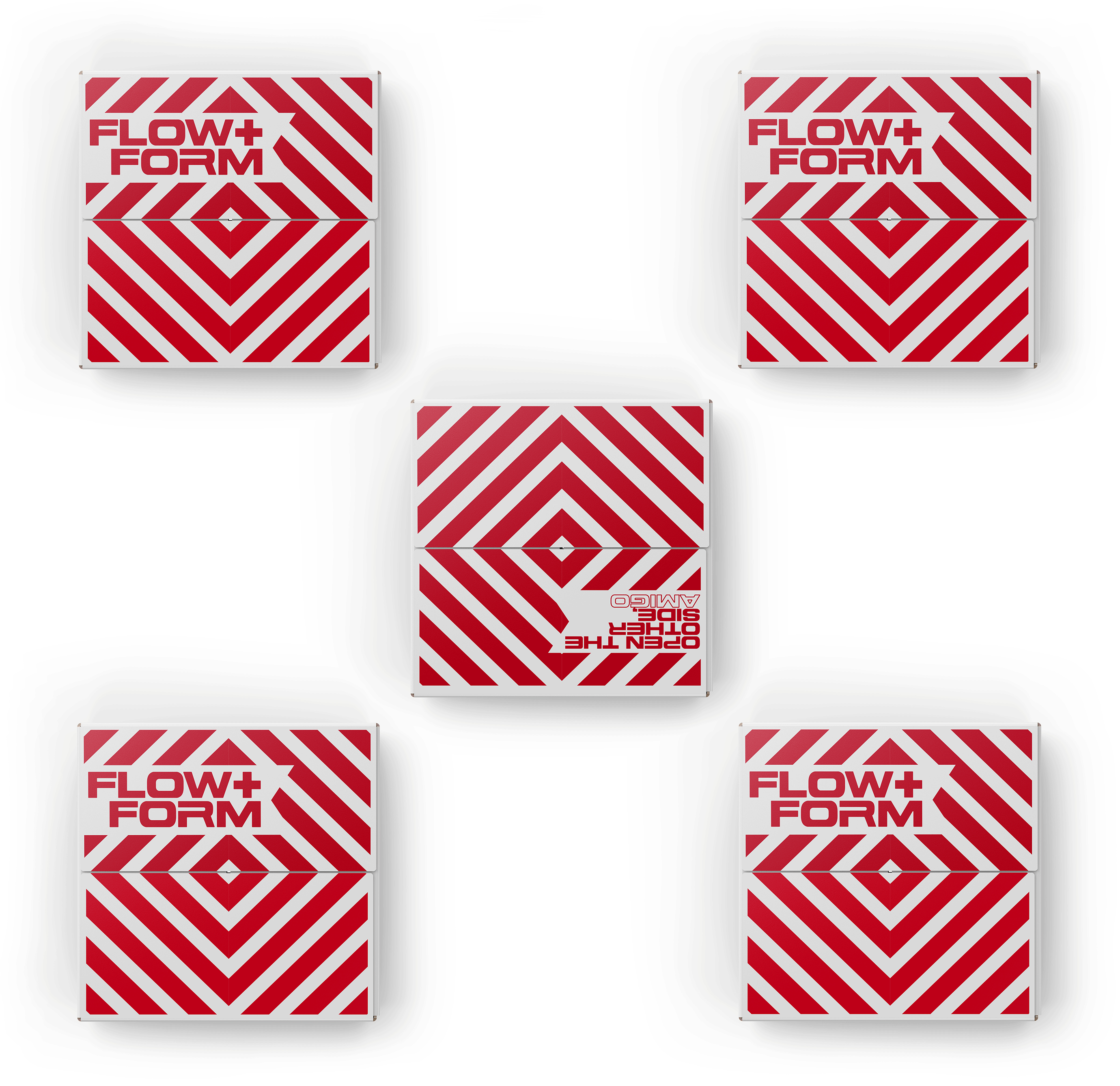
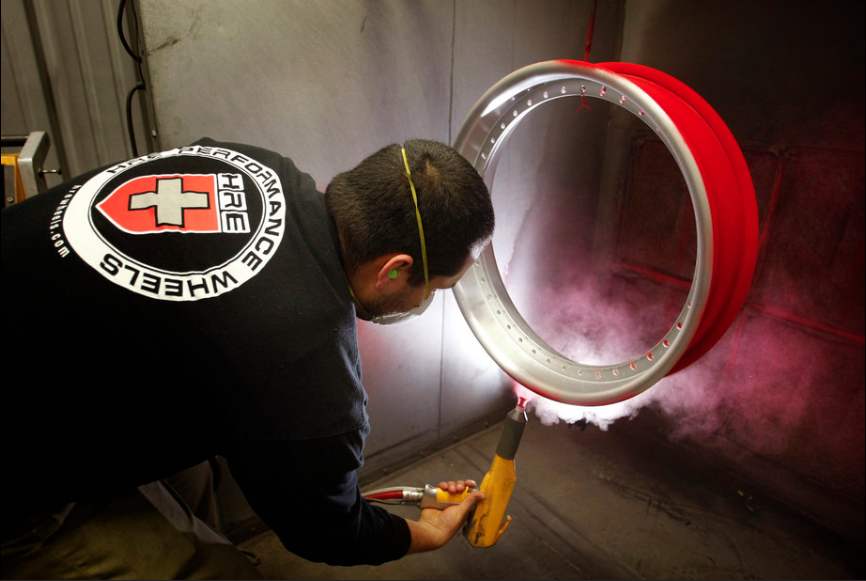
[caption id="attachment_47062" align="aligncenter" width="1024"] FlowForm Wheels by HRE packaging - by Valhalla Design & Conquer[/caption]Whole case study is up for FlowForm Wheels by HRE. Marketed towards the entry-level market, with the "Things are about to get awesome" & "Other side, amigo" messaging on the box, the Southern California lifestyle is engrained in the brands DNA. Check it all out here:...


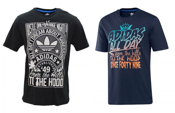 Been working a lot with one of the best companies on earth, Adidas. There’s a slew of our designs on their shirts recently. A few of my favorite designs ever are included in the F12 season, in stores now. Up top is a


 Rad project about one of my favorite songs ever. Check after the jump for a few more.
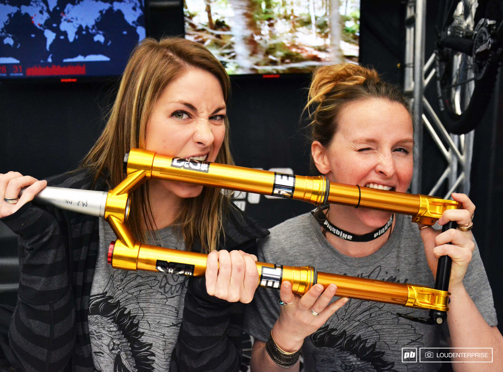
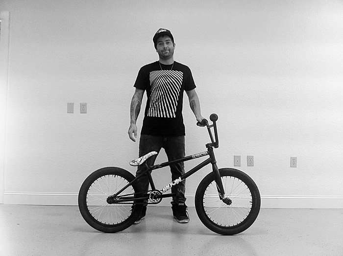
  The newest obsession in this joint is riding downhill mtn bikes & we’re ready for the season to start. Thanks to Tyler at
 There’s a reason he’s on the $100 bill. These tips apply to all aspects of life, making the connection to design is pretty simple.
 Amazing work by
 Great article on
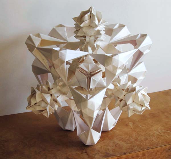
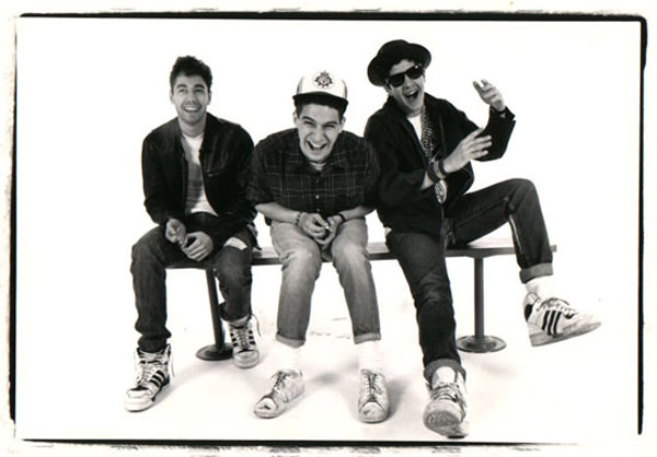

 Pretty great collection of Polish posters over on
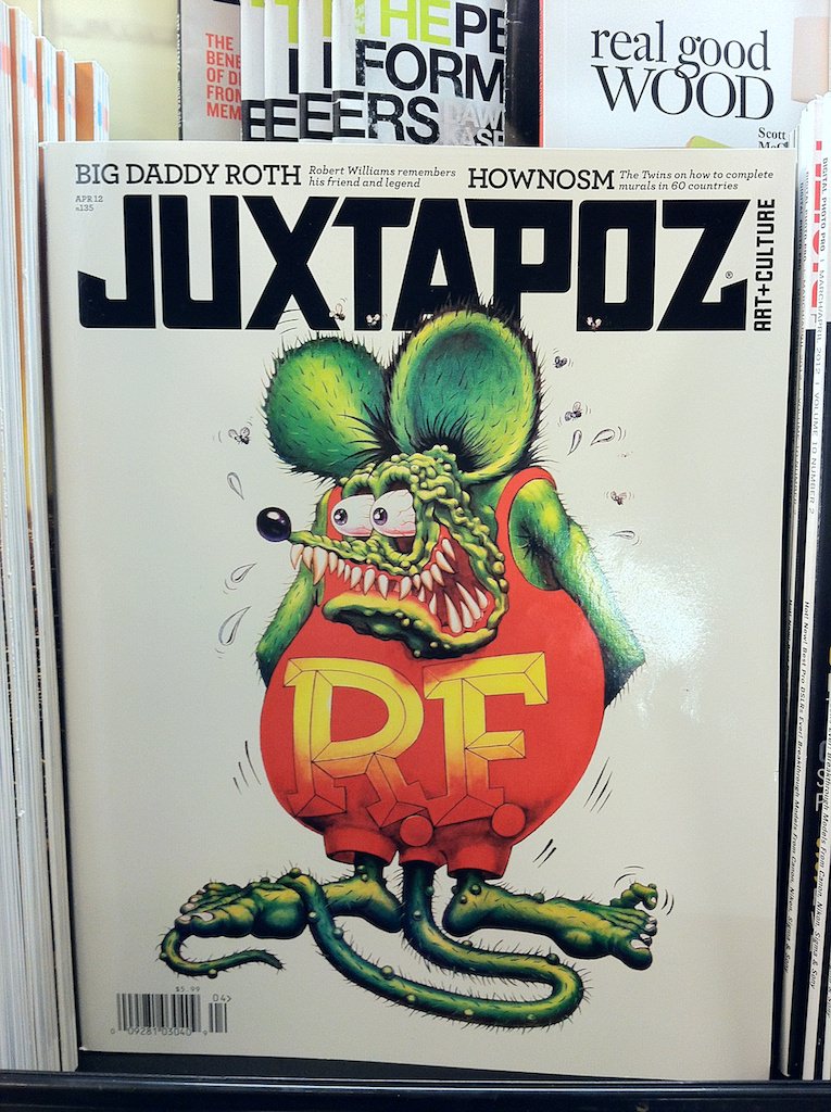


 How did the nail get there? There’s no trickery involved. Check after the link for the video showing how they did it.
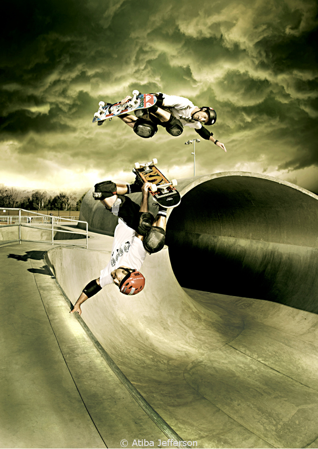
  A few months back I got a call from the guys at Plan B, wanting a mini-series for the team based on my
  As usual, I’ve had to keep these under wraps for some time. A bunch of beanies / facemask designs for Outdoor Research last summer which recently launched so we can finally blab about them. Check them out or grab one on
 Great animal portrait series by
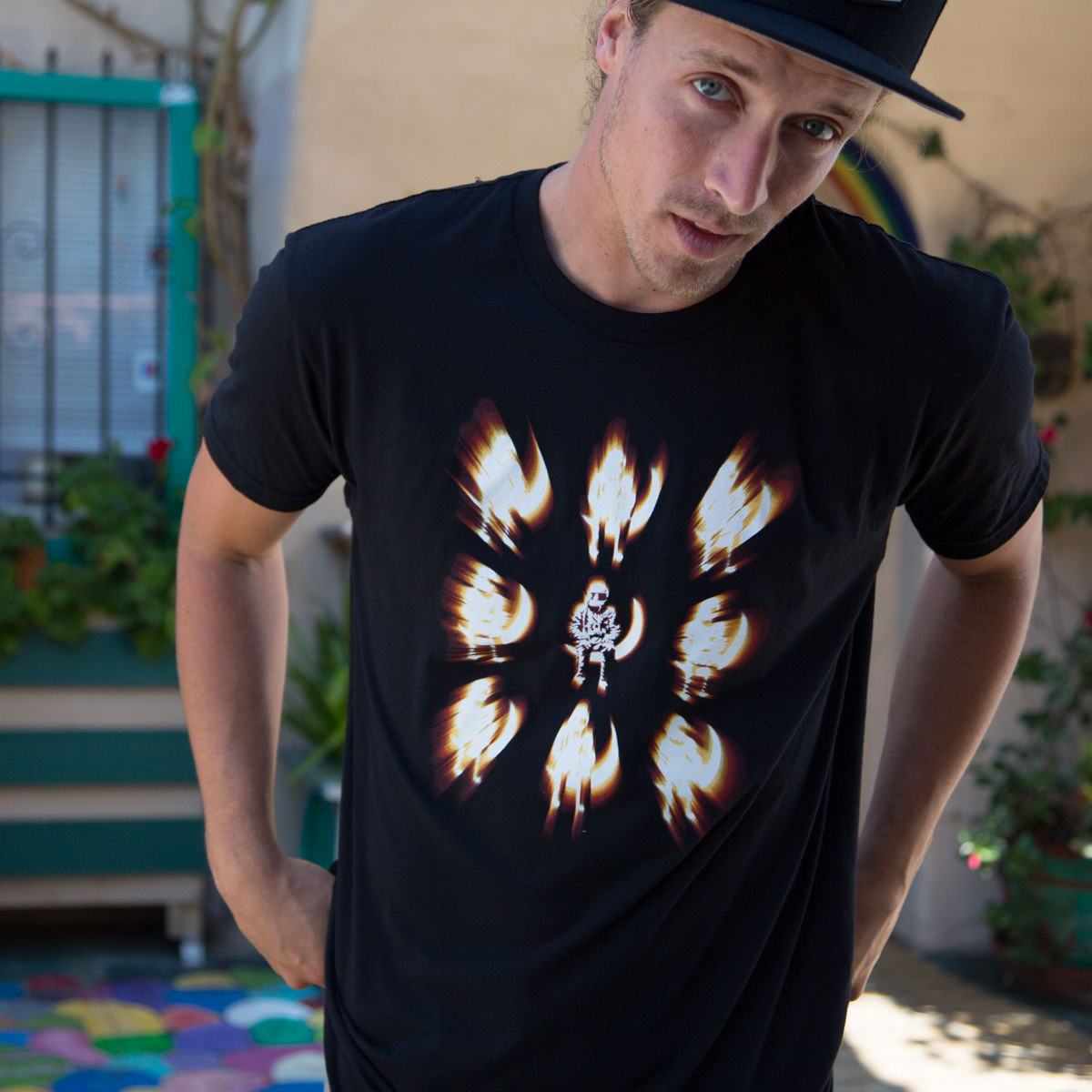
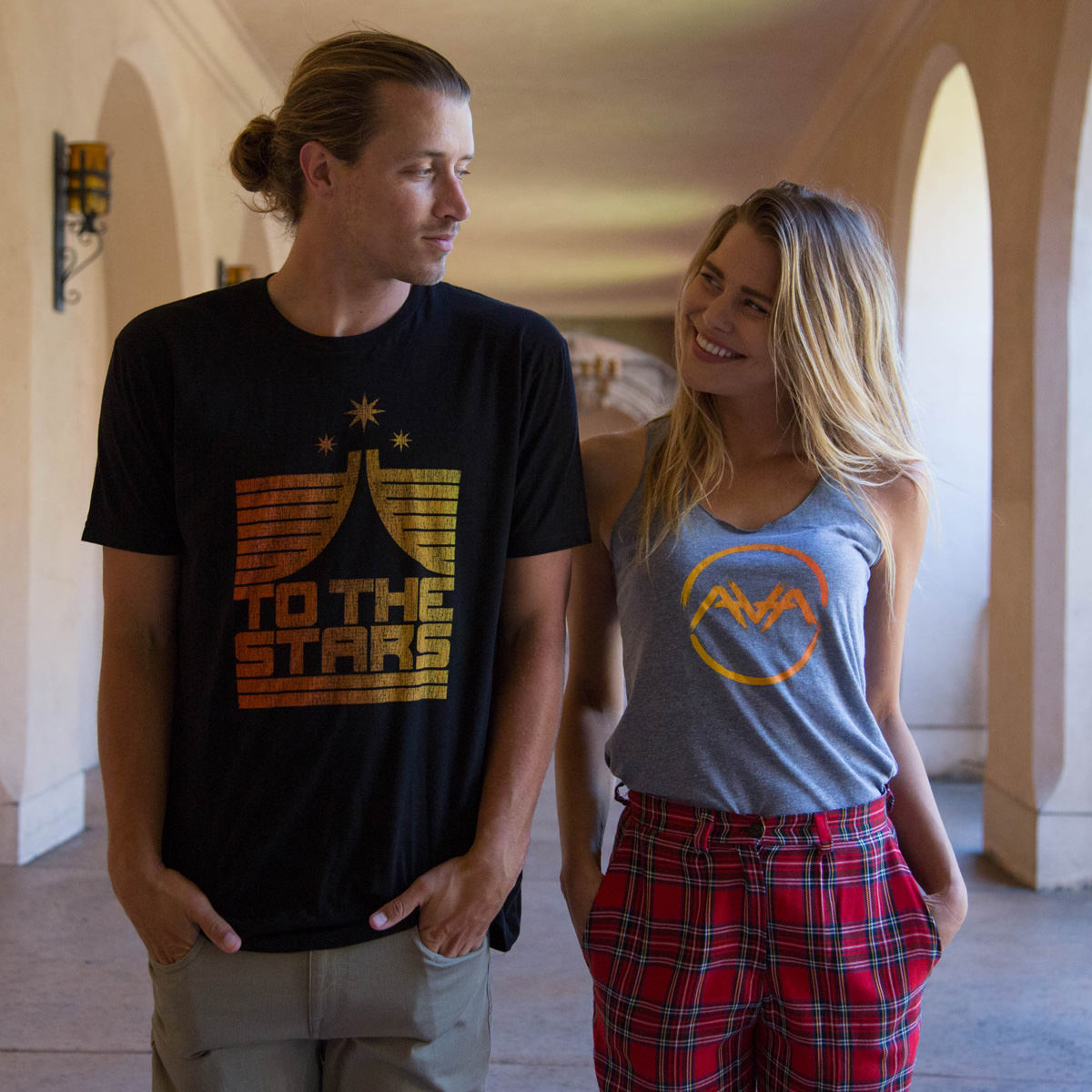
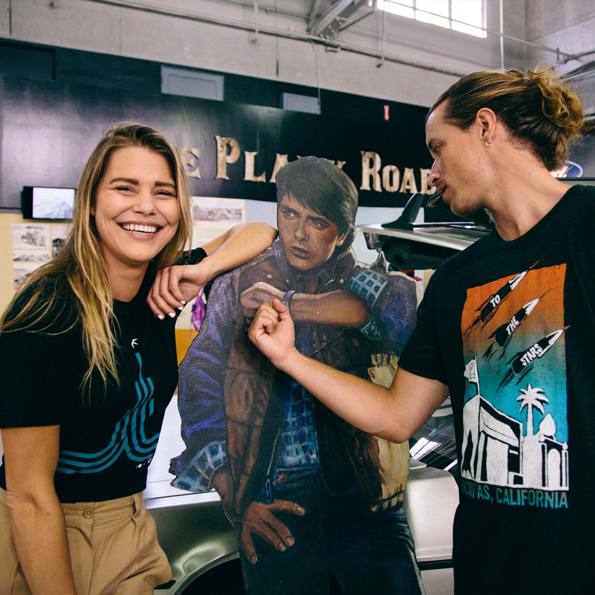
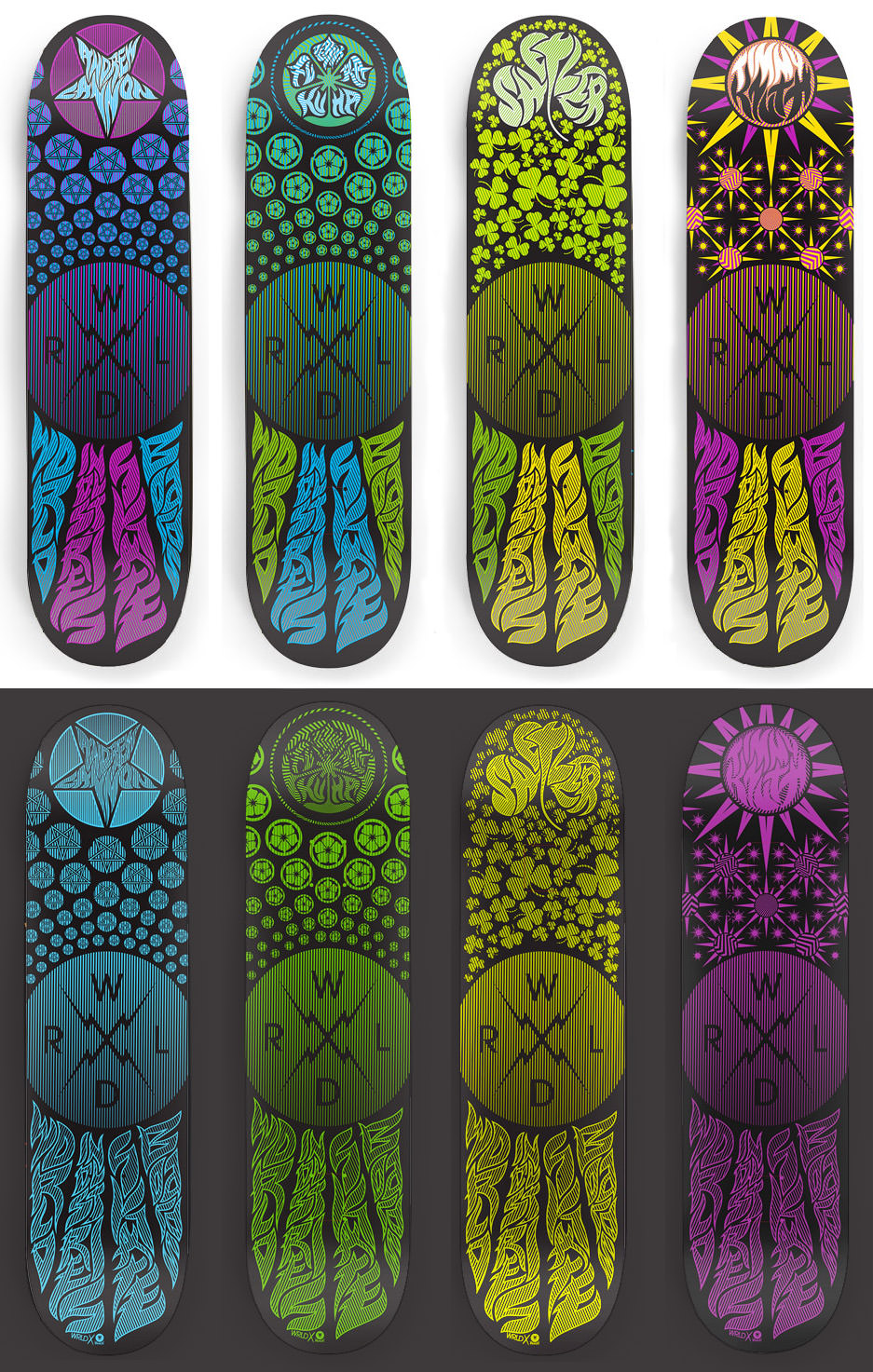
 Ok, so we’ve never actually even been to Long Island but the word play was too fun not to use. Collection of our shirts, most you’ve probably seen before & 1 that’s printing soon. Check inside for the full collection, up above is just a preview.
 Rolled back from lunch today & saw this sitting outside the shop. Wonder what it could be…. more inside
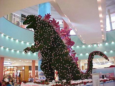
  A whole lot of awesome showed up at the door today. I love it when any surprise package comes in but three in a day is like Christmas to me! GodMachine, Hydro74 & The Shadow Conspiracy all come through with some amazing. Check after the jump for details, stories & links.
  Great work here by
  Oh hell no. Love snakes, super cool creatures. But see how these have diamond shaped heads? That means they’re not nice snakes. Pretty amazing collection of snake photos over
  Great font called Crescendo by